Tuesday, 29 August 2017

Gregory Crewdson: Cathedral Of The Pines

Cathedral of The Pines

I visited this fantastic exhibition of the art-photography of Gregory Crewdson at the Photographers' Gallery (again) recently. The photographs from this series are really large prints, shot on a large format camera, as befits Crewdson's cinematic vision. The images speak of the vastness and majesty of nature, and the sense of isolation and claustrophobia experienced in interiors. Crewdson's work has many parallels with that of American painter Edward Hopper's (here) in this respect. The setting of the photographs and the title of the exhibition refers to a hiking trail in the mountains of Massachusetts, and so evocative are these images of nature, you can virtually smell the heady scent of the pine forests in which they are set.

The Mattress

The VW Bus

The Motel

All of the images - be they landscapes, or interiors - are beautifully composed. In all of the photographs there is a tacit, tense, narrative which suggests the viewer has just stumbled upon a drama, or that one has just occurred, making you question what is actually happening, especially in those images in which there is the presence of emergency service personnel or vehicles. You wonder why the emergency services were called, what incident took place, and if anybody was actually harmed. In these photographs it is clear to see that Crewdson, like Hitchcock before him, is a master at evoking a sense of psychological tension. There are also nods to 19th and 20th century European landscape paintings. One photograph in particular - The Quarry - reminded me of Manet's Déjeuner sur L'herbe, in its setting and staging for some reason.

The Pick-Up Truck

The Shed

Woman In Bathroom

Woman At Sink

All of the female figures in the photographs appear to have an air of melancholy about them. They seem like prisoners, trapped in their home environments, confined to a lifetime of domestic drudgery, looking longingly out of the windows into the wider world for a means of escape. Others because of the way in which Crewdson has lit them, look waxen, lifeless, or prone because of their nakedness. 

The Disturbance

Sisters

Reclining Woman On Bed

The interiors are also interesting in themselves. They are like meticulously composed time capsules, homages to the 1970's - all shades of tan, brown and orange - and suitable attention has been paid to the details with the sourcing of period accessories like the old landline telephones. Looking at these photographs it becomes clear that they are actually composed of pictures within pictures. There are lots of frames within frames, as the figures are framed within the window frames, door frames, mirror frames, and there are further frames of pictures on the walls. When you look closer into the photographs in the series you can see that all of the pictures hanging on the walls of the interiors are actually landscapes, cleverly mimicking the real landscapes seen out of the windows and bringing the outside into the interior, or reference the landscapes seen outside of the windows. The interiors have an eerie stillness, and quiet reminiscent of a Vermeer or Hammershøi, adding to the sense of atmosphere and tension.

Reclining Woman On Sofa

Pregnant Woman On Porch

Beneath The Bridge

I have visited this exhibition twice so far, and both times have discovered something new in the details of these large, cinematic photographs. If you can make time to visit this show then do so, you will be inspired and more than well rewarded for your efforts.


Gregory Crewdson: Cathedral Of The Pines
until 8th October
The Photographers' Gallery
16-18 Ramilies Street
London
W1

Thursday, 24 August 2017

Ravilious & Co: The Pattern of Friendship


I escaped London briefly to spend a day beside the seaside, (beside the sea!) in Eastbourne. As well as enjoying the fresh sea air, I was there to take in - Ravilious  & Co: The Pattern of Friendship, at the Towner Art Gallery. Ravilious's work has become so ubiquitous recently that there isn't really much new to say about him. This though, is one of the better of the recent exhibitions on Ravilious. Its main focus is primarily on Ravilious, but it enhances his reputation by also exhibiting the work of his wider artistic circle with contributions by John and Paul Nash, Edward Bawden, William Nicholson, and the lesser celebrated work of the women in that crowd such as Peggy Angus, Enid Marx, Phyllis Dodd and Helen Binyon. Phyllis Dodd's portraiture in particular was a revelation to me. As well as the example of Ravilious below, there were two other portraits of Bawden and Douglas Percy Bliss by Dodd, which I thought superbly displayed her talents both technically and aesthetically.

 Phyllis Dodd - Portrait of Eric Ravilious

Eric Ravilious - Channel Steamers Leaving Harbour, 1935

Eric Ravilious - The James and The Foremost Prince, 1934

Eric Ravilious - Beautiful Britain, calendar design, 1939

There are lots of examples of just how fantastic and versatile Ravilious was as both an artist and designer. His watercolour technique was so outstanding and descriptive, as was his decorative wood engraving style. There are also examples of his furniture design as well as the wonderful designs on ceramics which he completed for Wedgewood. Another fascinating aspect of this exhibition is the amount of artworks which have never been publicly exhibited before, or since the 1930s. The serene painting HMS Actaeon, below, is a recently discovered lost treasure by Ravilious.

Eric Ravilious - HMS Actaeon, 1942

Eric Ravilious - Monotype Corporation Calendar, 1933

Eric Ravilious - Horoscope Engraving

Eric Ravilious - UK Pavilion Catalogue for Paris International Exhibition, 1937

Eric Ravilious - Chair Design for Dunbar Hay made by Henry Harris, 1936

Other gems in this exhibition for me were these two examples of Bawden's watercolour technique. I liked the way in which he would scratch back into the wet paint to create interesting marks and textures. His flair for pattern-making and design was just as strong as Ravilious's. Bawden's designs for wallpapers were lovely, and it great to see that some of these will be revived and made available again later this year by textile/wallpaper companies St Jude's and CommonRoom. St Jude's in particular have been very instrumental in the current vogue and appreciation of all things mid-century.

Edward Bawden - Back Garden At Great Bardfield, 1936

Edward Bawden - The Pond Great Bardfield, 1933

Edward Bawden - Chestnut Sunday; Bushey Park, London Transport poster, 1936

 Edward Bawden - Waves & Fishes (Lagoon), 1929

 Edward Bawden - Sahara, 1928

Edward Bawden - Curwen Press Newsletter No. 9

The graphic work of Barnett Freedman is absolutely stunning. He just understood typography, and illustration so well, and combined these with processes such as lithography perfectly to create outstanding outcomes.

 Barnett Freedman - Trooping The Colour, 1937

Barnett Freedman - Curwen Press Newsletter No. 5

Barnett Freedman - Behold The Dreamer, book jacket design, 1939

William Rothenstein - Portrait of Barnett Freedman, 1925

 William Nicholson - Portrait of Diana Low, 1933

 Paul Nash - Black Poplar, 1922

 Diana Low - Portrait of William Nicholson - 1920-36

Helen Binyon - The Wire Fence, 1935

Enid Marx - Bulgy The Barrage Balloon, children's book 1941

Enid Marx - Cornucopia textile design,

Enid Marx - Zig-Zag textile design,

Tirzah Ravilious - Epton, marble paper design


Ravilious & Co: The Pattern of Friendship, cements the reputation of the artist and also importantly showcases the work of unsung female artists in the circle who were forced to give up their careers to raise families, or were marginalised by galleries and the art market of the time. It's a really good display of art, and other design disciplines such as graphic design, illustration, textiles and furniture. Exhibition duly enjoyed, it was time to head back out into the sunshine to explore Eastbourne and hit the beach.


Ravilious & Co: The Pattern of Friendship
until 17th September
Towner Art Gallery
Devonshire Park, College Road
Eastbourne
towner@townereastbourne.org.uk


Saturday, 19 August 2017

Pierre Paulin: Butterflies Through Other Eyes #34


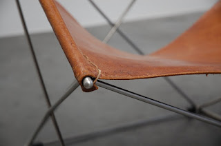
I recently featured a design classic - BKF's Butterfly Chair (here). The influence of the butterfly in modern design can also be seen in this product - another Butterfly Chair, this time by French furniture/interior designer Pierre Paulin (1927-2009). The chair takes its name from the butterfly-shaped tubular metal framework which supports the leather slings which make up the seat and backrest. The Butterfly Chair was created by Paulin as part of his collaborations with design company Artifort during the 1960s - 70s. The design is possibly a homage to the earlier, but similar iconic BKF/ Hardoy 1938 Butterfly Chair design, which also features a leather sling over a metal framework. Paulin's other chair designs were made using foam and a metal frame covered with stretch materials which were considered both modern and unique and are still highly collectable today. Other famous chair designs by Paulin sought out for their clear lines and body-hugging shapes include the Orange Slice, Ribbon, and Tongue chairs.