Tuesday, 26 September 2017

Sori Yanagi: Butterflies Through Other Eyes #36


I have been featuring a range of chairs inspired by butterflies in my Butterflies Through Other Eyes series (here, and here). As the London Design Festival has just come to an end in the capital I thought it was time to give attention to another classic butterfly inspired piece of product design in the form of this iconic Butterfly Stool, by Japanese product designer Sori Yanagi (1915-2011). 

 
Yanagi was a modernist who twinned simple, functional design with traditional elements of Japanese craftsmanship.


Key influences in his design aesthetic was the work of both architect/designers Le Corbusier and Charlotte Perriand. The Butterfly Stool is perhaps Yanagi's most famous piece of design. It was designed in 1954 and is composed of two shells of either maple or palisander wood - the silhouettes of which are curved to resemble butterfly wings. 

The plywood shells were shaped and moulded using a technique developed by Ray and Charles Eames. Holding the two moulded wooden shells together is a simple, elegant metal bar and screws. The shape of the Butterfly Stool has also been likened to the gates of a Shinto shrine and antique samurai helmets. The Butterfly Stool was first exhibited in the west at the 11th Milan Triennale in 1957, and has been in production ever since. A true modern classic.


Friday, 22 September 2017

London Design Fair, Designjunction and Design Frontiers 2017


I visited the London Design Fair at the Old Truman Building on Hanbury Street/Brick Lane as part of the London Design Festival yesterday. I had been invited to attend by the Portugese Pavilion, and having gratefully accepted, really enjoyed their display and exciting product designs. (Thank you Mr David G!) Their CRU/RAW display of the best of contemporary Portugese design was very well recieved. Nuno Rodrigues' wooden Le Petit Chandelier below, was absolutely amazing, and like a piece of classic mid-century Swedish design. I also loved João Bruno Videira's colourful, tactile, stripey Wool Stones which are handmade sculptures that also function as footstools below.


The beautiful designs, (of what look like), lacey, lasercut metallic panels in the Italian Pavilion (below), were also noteworthy and caught my eye.


After this it was round the corner to the St Jude's In The City pop-up at the Townhouse - Spitalfields. I got so caught up in chatting to Simon (one half of the dynamic St Jude's duo), that I forgot to take pictures of their residency. Their display was as per usual immaculate, with covetable prints from Simon's other half - Angie Lewin, as well as Chris Brown, and new/old wallpaper designs and prints by the venerable Edward Bawden, and a new fabric design by Mark Hearld. 

 Seaweed - Edward Bawden

Bantam Bough - Mark Hearld

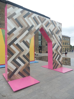
I then made a trip up to Kings Cross to see Gateways - the main event of DesignJunction, which was the installation of four, 4 metre high tiled gates commissioned by Turkishceramics and designed by Adam Nathaniel Furman. The first gate is based on traditional Iznik ceramics and tells the story of Paradise, whilst the other gates reference the 1970s, Edwardian architecture and wood and stone building materials.


The Gateways were striking ceramic designs full of colour and pattern, and very popular with the public. Photography was difficult as people wouldn't get out of the bloody way!


I also liked the large canal-side lettering installation by Campari and their customised narrowboat, where you were invited to take a break from the design frenzy and relax with a glass or two of the refreshing Italian apéritif.


After this, it was down to the classical setting of Somerset House for Design Frontiers. I wasn't sure whether I would like this feature of the Festival, but it was one of the best events of the whole Design Festival. The way the various designers involved embraced and showcased design and technology was absolutely stunning, and perhaps what was missing at other design hubs making them seem somewhat lacklustre. 


This interactive display by Jaguar was absolutlely stunning, projecting film onto a prototype design of a futuristic car, and then animating the background to take us for a spin around the Somerset House courtyard. Absolutely amazing! This installation finally supplied the wow factor in design that I was in search of throughout the Design Festival.


Another visually arresting installation was Materialise, above, by Kate Greenyer of Pentland Brands, whose work utilises innovative pattern cutting and fabric technology to aid athletes to perform at their peak. The quality of the graphic design of her publicity material and hand-outs were also outstanding.


The room devoted to the installation by designer Dominic Lippa - Dominic Lippa: Facts and Figures, was really thought provoking. It presents data and statistics in the form of these handsomely designed books which provoke guilt, anger, intrigue and astonishment at the human condition and behaviours. The public are invited to take the books of random facts and data away with them. It was great to finally have something to be challenged by from the Design Festival, that we could also take away and digest at leisure.


Luminous Reflections - Toord Boontje's collaborations with Swarovski crystal also had the sophisticated design wow-factor. I would quite happily find a place for these exquisite lighting pieces in my home. Just beautiful, and very inspiring!


After the technical sophistication of Jaguar and Tord Boontje, I enjoyed the playfulness of - My Canvas - an invitation by textile design firm Kvadrat to both established and emerging designers to respond to the theme of Canvas. Some of the resulting outcomes below, were by turns mad, sophisticated and inspired. Again just wonderful!


Design Frontiers was a fantastic experience, and easily featured some of the best work of the London Design Festival 2017. I hope it returns again next year for a 2018 edition.


Saturday, 9 September 2017

The Monument


Whilst I was in the City I paid a visit to Sir Christopher Wren (and Robert Hooke's), Monument to the Great Fire of London, built between 1671-1677. The Monument is something I've passed and photographed so many times before but never really felt the need to climb. I decided to remedy this on a bright, sunny day which would afford the best views across the city. It was a really enjoyable experience and I wondered why I hadn't done it sooner. The Great Fire started on 2nd September 1666.

The Great Fire of London - Dutch School c.1666


I handed over my fiver entrance fee at the front desk, and began my ascent of the 202 ft (62m) column's 311 steps. It wasn't too hard a trek.


I did begin to feel the burn half way up though, and rested to check my progress out of a porthole. Determined to reach the top nonetheless, I duly soldiered on with wobbly legs and reached the goal.


Some ancient graffiti at the top of the stairs.


The panoramic views at the top were spectacular and well worth the effort of the climb.


Wren's other masterpiece - St Paul's Cathedral


I enjoyed being close to the golden ball of fire at the top, and seeing the twisted tongs of gilded flames licking at the sky.


Amazing London vistas appreciated, it was time for the descent.


One last look back to the top


Back down to earth you are awarded a certificate - a little reward for your efforts, and a nice memento of the climb.


The Monument
Fish Street Hill
London
themonument.info