The term 'bokeh', comes from the Japanese term 'boke' and literally translates as 'blur' or 'haze'. With bokeh emphasis is placed on certain points of light in the background, with bokeh appearing as a backdrop to the focal area. The subject remains clear and in focus while the background is blurred, with vibrant, circular points of light reflection. The points of light are circular because that’s how the lens rendered them. The soft “feel” of those circular areas is what photographers would call “good bokeh” (when the effect is nice to look at). "Bad bokeh" is when the blur effect detracts from the overall quality of the image. Some photographers incorrectly restrict use of the term bokeh to the appearance of bright spots in the out-of-focus area caused by circles of confusion. In optics, a circle of confusion (CoC) is an optical spot caused by a cone of light rays from a lens not coming to a perfect focus when imaging a point source. It is also known as disk of confusion, circle of indistinctness, blur circle, or blur spot.


 Thrall (Gold)


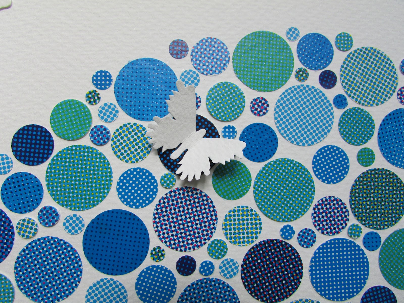


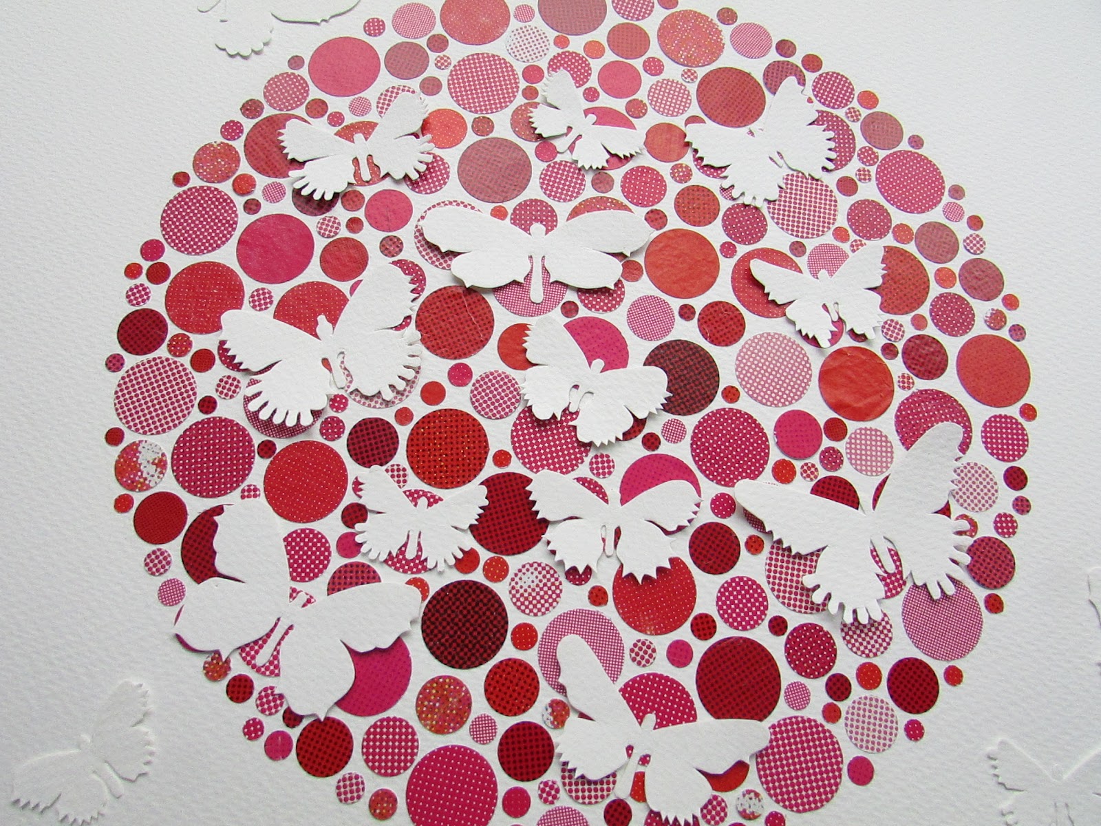


The qualities of good bokeh are strong enough to be abstract images in their own right. They evince a magical effect, with such intensity of colour in some images. I chose to configure the dots into my usual signature circular formation using my ben-day dot printed colour papers. Having laid out the background matrix of dots I realised that the form of these new Thrall pieces (without the butterflies overlaid on top) are reminiscent of Ishihara test plates developed by Shinobu Ishihara in 1917. These are also related to the way we see and perceive. Ishihara tests examine visual perception and the red-green colours that are problematic and indistinguishable to certain people with condition colour blindness. The Colour Blind Test or the Ishihara test contains a number of coloured plates containing a circle of dots appearing in random order of colour and size. Within the circle of dots are dots of a different colour which form a number or shape clearly visible to those with normal colour vision, and invisible, or difficult to see, to those with a red–green colour vision defect.
I have always used the circular format in my work, but an interest in using circles and dots for their decorative potential in the form of patterns and as a ground for the butterflies has gradually crept into my work since a visit to Vienna and coming across the circular paving stones in Stadtpark and also a wonderful Max Ernst painting in the Albertina detailed here. The dots in the background of my Thrall pieces are meant to represent a purely visual sensation like that evoked by bokeh, and are nothing to do with colour blindness. I have chosen to keep the hole-punched circular dots making up the background of my Thrall pieces to various shades and close tonal harmonies of one or two colours, rather than the multicoloured balls of light seen in photographs with good bokeh. I have chosen not to add anything but white butterflies on top to avoid making the pieces appear overly busy. There is already so much for the eye to absorb in these pieces. The white butterflies on a coloured spotty ground give rise to a certain definite visual sensation as the eyes attempt to distinguish their shapes from the white gaps between the circles of colour. I will be presenting further new designs and variants on the bokeh theme created using matrices of dots in future posts.

Thrall (Blue)